
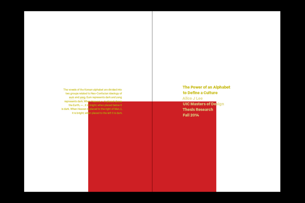
The Power of an Alphabet to Define a Culture
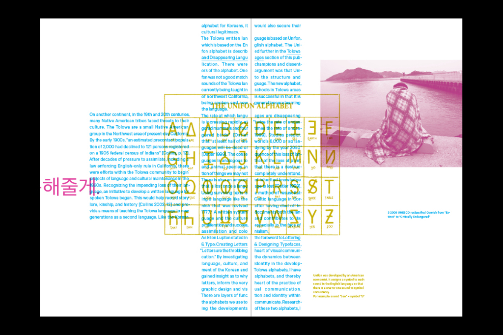
My thesis research started as an investigation into literacy and power, studying the development of the Korean alphabet as a case study. My research extended into disappearing languages and how the development of an accessible writing system, a phonetic alphabet, helps preserve the language and the culture embodied in it. An alphabet acts as a visual representation of the language and the culture, and has the power to assert the legitimacy of a culture.
The Korean alphabet is an amazing invention and considered one of the most scientific alphabets ever developed. The alphabet’s development, structure, and graphic forms are based on neo-Confucian principles. As the neo-Confucian philosophy informed the structure and design of the Korean alphabet, I investigated how it can inform the design of my thesis book.
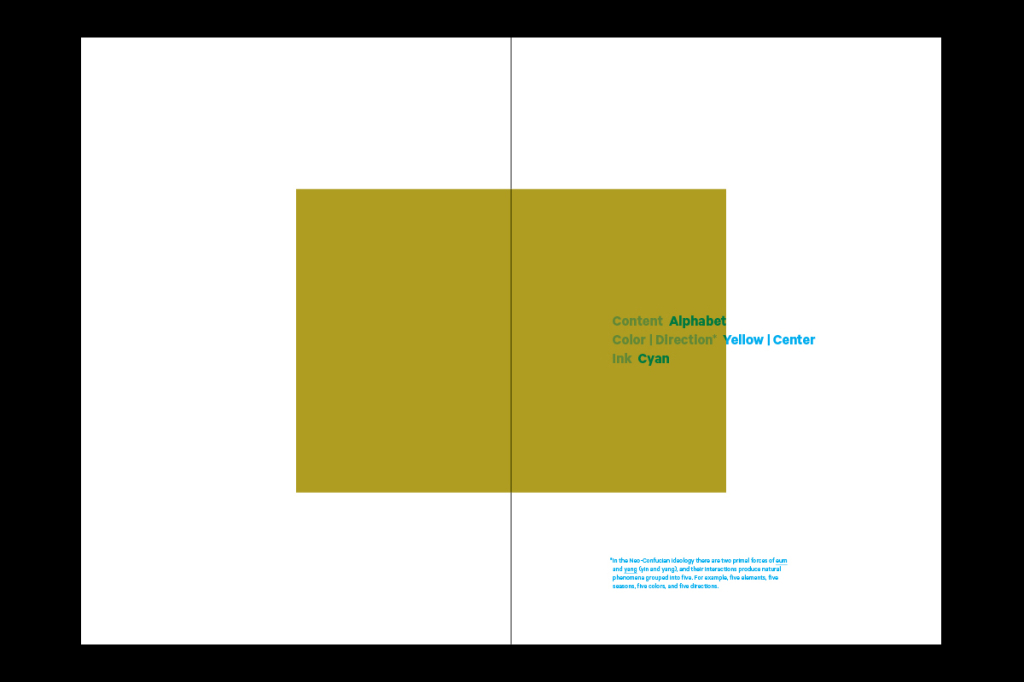
Eum and Yang (yin and yang) are the two primal forces, and their interactions create natural phenomena grouped into five. Five elements, five colors, five directions.
Therefore, I structured my thesis book into 5; 4 sections, each making 1 whole, creating 5.
Each section represents one direction, i.e., center, and its corresponding color, i.e., yellow. The images are a monotone of that color, positioned in the direction.
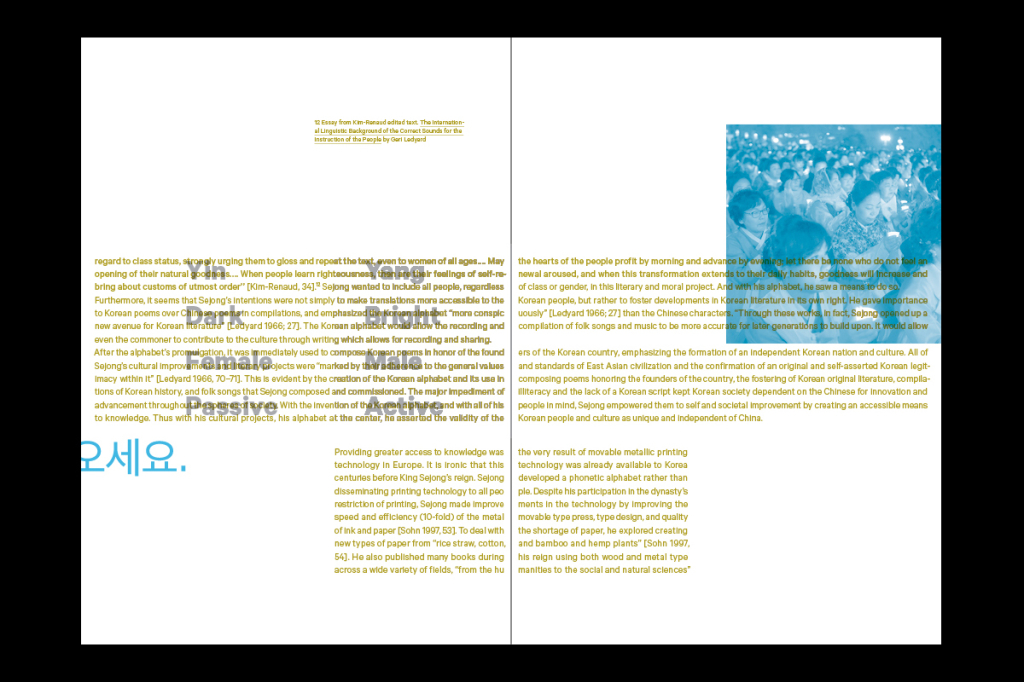
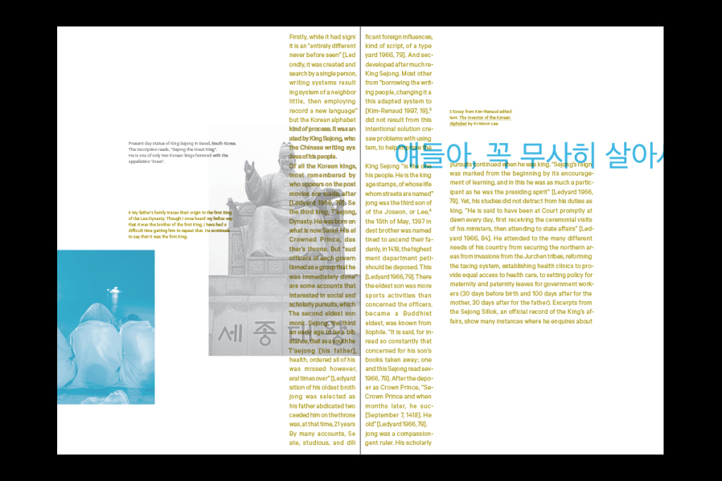
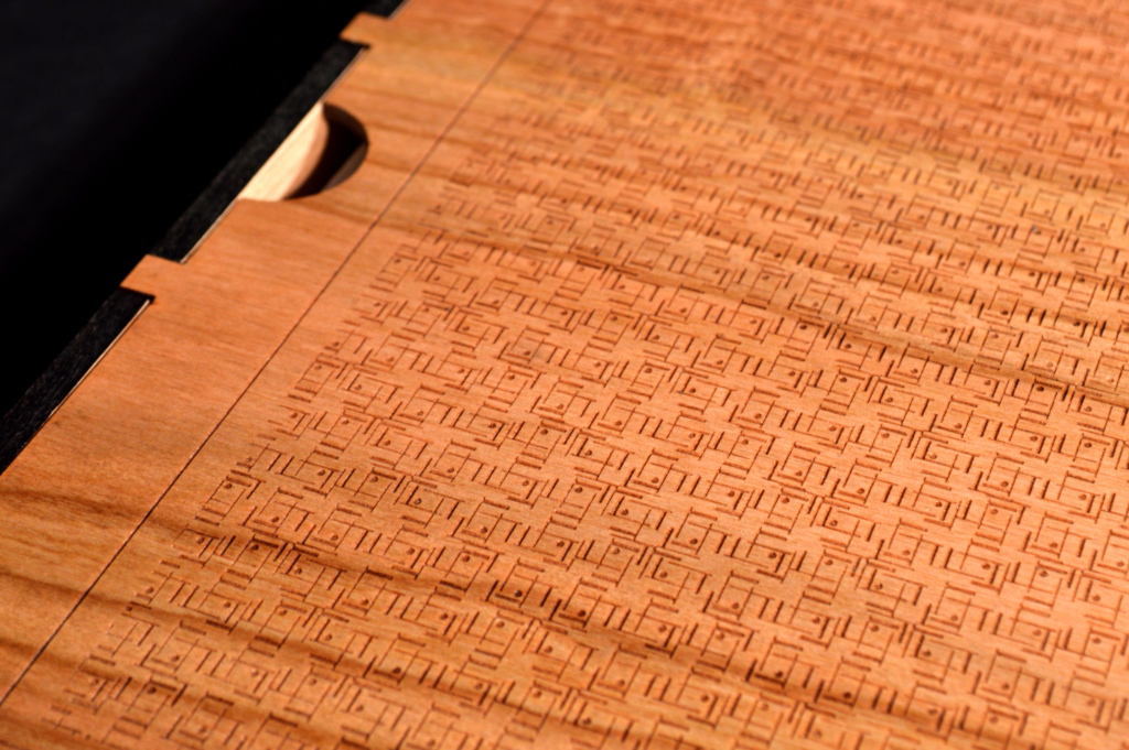
As the vowel symbols represent Heaven, Earth, and Man, I explored the vertical and horizontal natures of these symbols within the spread, acknowledging the edges of the paper and its fold.
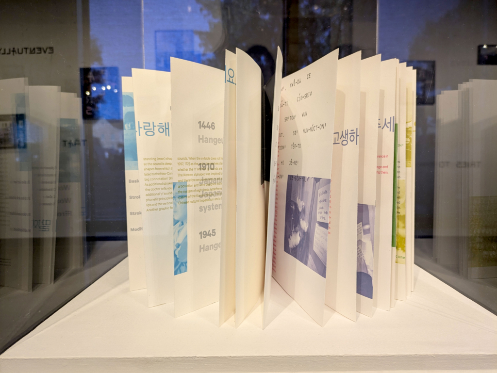
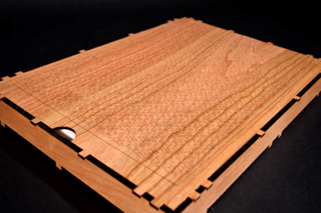
The book is bound as an accordion fold to emphasize the idea of interconnectedness. The end is connected to the beginning to further emphasize this idea. It also prevents the book from closing and encourages you to start at any point.
In April 2014, there was a tragic ferry disaster off the west coast of South Korea. There are layers of the text, the images, and then the ferry text and images. I set up distinct structures and rules for each layer, enabling surprising combinations.
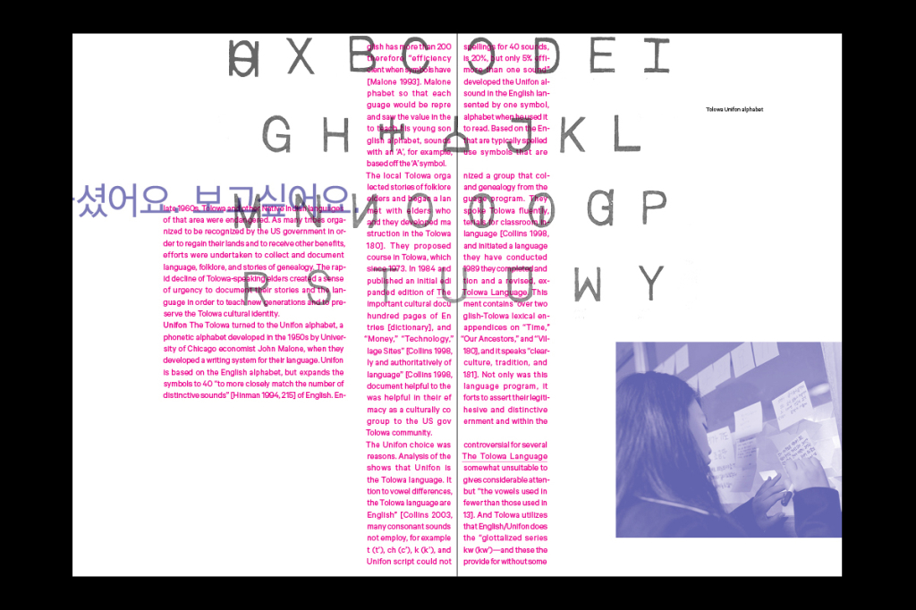
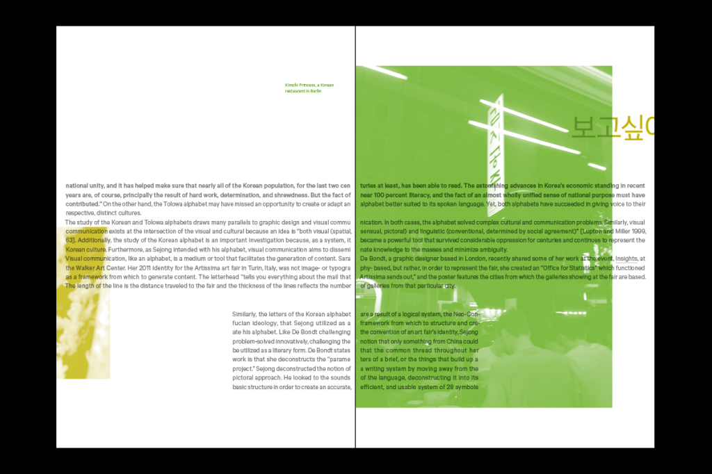
As the ferry messages demonstrate the power and agency of the written word, I allowed the ferry images and text from the written notes to respond freely to the structured main content text and images. It’s also a way to showcase the Korean alphabet. The images and text are colored as a combination of two inks; each section has its own color.
I chose the typeface Calibre, a typeface based on Berlin street signs, because it is a utilitarian face, just as the Korean alphabet is one of utility. So the question for me was, could I design something beautiful using something utilitarian? Is there beauty in something so functional, so useful?